The Challenge
AI was exploding, but there was no single hub to compare, test, and use the best tools in one place.
ChatGPT
For text generation
Claude
For analysis
Midjourney
For images
Constant context switching = Lost productivity
"I waste half my day switching between ChatGPT, Claude, and others."
— AI Knowledge Worker
Initial Constraints
- Limited Budget — Needed to demonstrate MVP quickly with minimal resources
- Investor Validation — Prove scalable SaaS opportunity and product-market fit
Discovery & Research
Understanding the AI aggregation landscape
Competitive Analysis
Evaluated 30+ AI tools across features, pricing, and UX patterns
20-page competitive landscape reportUser Interviews
12+ interviews with AI researchers and knowledge workers
Identified 3 core persona typesCompetitive Analysis Highlights
| Tool | Cost (at time of research) | Strength | Gap We Could Fill |
|---|---|---|---|
| ChatGPT | $20/mo | Best general-purpose chat UX | No model comparison, single-provider lock-in |
| Claude | $20/mo | Strong analysis, long context | Separate subscription, no cross-tool workflows |
| Midjourney | $10/mo | Best image generation quality | Discord-only UX, steep learning curve |
| +27 more tools analyzed across text, image, code, and audio categories | |||
User Interview Highlights
"I spend more time managing subscriptions than actually using the AI tools. It's exhausting."
"There's no easy way to compare outputs from different models. I have to copy-paste everything manually."
"I need something that works across my entire team, but every tool has different pricing tiers and limitations."
Synthesis & Key Insights
Affinity Mapping Session
Identified patterns from 12+ interviews 3 core persona types
Aggregation is the entry point
Users need a single dashboard to test and compare multiple AI tools before committing to subscriptions.
Free tier is critical for adoption
Lower barrier to entry with free baseline access increases willingness to explore premium features.
White-label opportunity for enterprises
Enterprises want branded AI solutions for their teams, creating a B2B revenue stream beyond subscriptions.
Define & Strategize
From research wall to product bet
User Personas
The Knowledge Worker
Product Managers, Researchers, Analysts
"I need to quickly test multiple AI models to find the best one for my use case."
Pain Points:
- Cost fatigue from multiple subscriptions
- Time wasted switching between tools
- Difficulty comparing outputs side-by-side
Needs:
Unified dashboard, comparison tools, transparent pricing
The Creative Professional
Designers, Writers, Content Creators
"I want to experiment with different AI tools without committing to expensive plans."
Pain Points:
- Budget constraints limiting experimentation
- No unified search across AI tools
- Overwhelming number of options
Needs:
Free tier access, discovery features, creative workflows
The Enterprise Decision Maker
CTOs, Team Leads, Department Heads
"My team needs a centralized AI solution with consistent access and billing."
Pain Points:
- Team coordination across scattered tools
- Lack of white-label solutions
- Complex vendor management
Needs:
White-label capabilities, team management, enterprise billing
Design Principles
One Prompt, Many Models
Users shouldn't need to re-type when switching between AI tools. Write once, run everywhere.
Free Gets You In, Value Keeps You
Lower the barrier with a real free tier, but make paid features genuinely worth upgrading for.
Show, Don't Compare
Side-by-side outputs speak louder than feature checklists. Let the AI results do the convincing.
Team-First Architecture
Enterprise needs — shared workspaces, billing, permissions — drove the structure even at MVP stage.
Questions We Actually Debated
- Build or aggregate? We chose aggregate — faster to market, and users wanted breadth over depth.
- How much free is too much? Settled on 50 prompts/month. Enough to form a habit, not enough to kill paid conversion.
- One workspace or per-tool views? Single workspace won in testing — users wanted to compare without context switching.
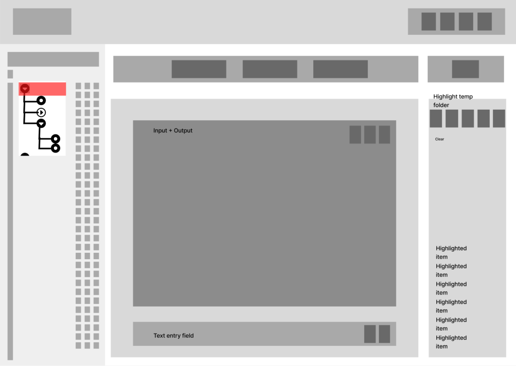
Design Evolution
From rough sketches to refined interface
Wireframe Progression
The Roads Not Taken
Tool-First Navigation
Rejected: Users needed workflow-based navigation, not tool categories. This added cognitive load.
Dense Top Bar Layout
Rejected: A/B testing showed sidebar navigation consistently outperformed top bar for tool discovery and reduced clicks to target.
Key Design Decisions
-
Sidebar vs. Top Navigation
A/B testing revealed that sidebar navigation clearly improved tool discoverability and reduced clicks to target. Users found it easier to scan vertically through tool categories — every participant in the sidebar group found tools faster.
-
Card-Based vs. List View
Card-based layouts tested better for tool browsing, providing visual hierarchy and quick scanning. List view reserved for detailed comparisons.
-
Unified Search Bar Placement
Prominent search placement at the top center became the primary entry point, enabling cross-tool search that users consistently requested.
Testing & Validation
10 users, 3 rounds, and the nav decision that defined the product
10
Usability Testing Sessions
3
Design Iteration Cycles
A/B
Navigation Patterns Tested
A/B Test: Navigation Pattern
Winner
Sidebar Navigation
- Clicks to tool: ~2 ~⅓ fewer
- Discovery rate: Higher clear signal
- Satisfaction: ~9/10 vs ~7/10
Version B
Top Bar Navigation
- Clicks to tool: ~3
- Discovery rate: Lower
- Satisfaction: ~7/10
Users found tools about a third faster with sidebar nav, and satisfaction scores climbed from ~7 to ~9. Small sample, clear signal.
Note: Tested with 10 participants (5 per variant). Directional, not statistically significant — but consistent enough to commit to sidebar.
Iteration Timeline
Iteration 1 • Week 1-2
Initial Prototype Testing
Tested with 5 users. Discovered navigation confusion and unclear tool categorization.
Key Change: Refined sidebar navigation for better tool density
Iteration 2 • Week 3-4
Refined Navigation & Cards
A/B tested navigation patterns. Sidebar showed clear improvement in discoverability across all participants.
Key Change: Enhanced card layout with better visual hierarchy
Iteration 3 • Week 5-6
Final Polish & Validation
Final testing with 3 users. Satisfaction scores consistently near 9/10. Ready for investor demo.
Key Change: Pricing clarity improvements based on feedback
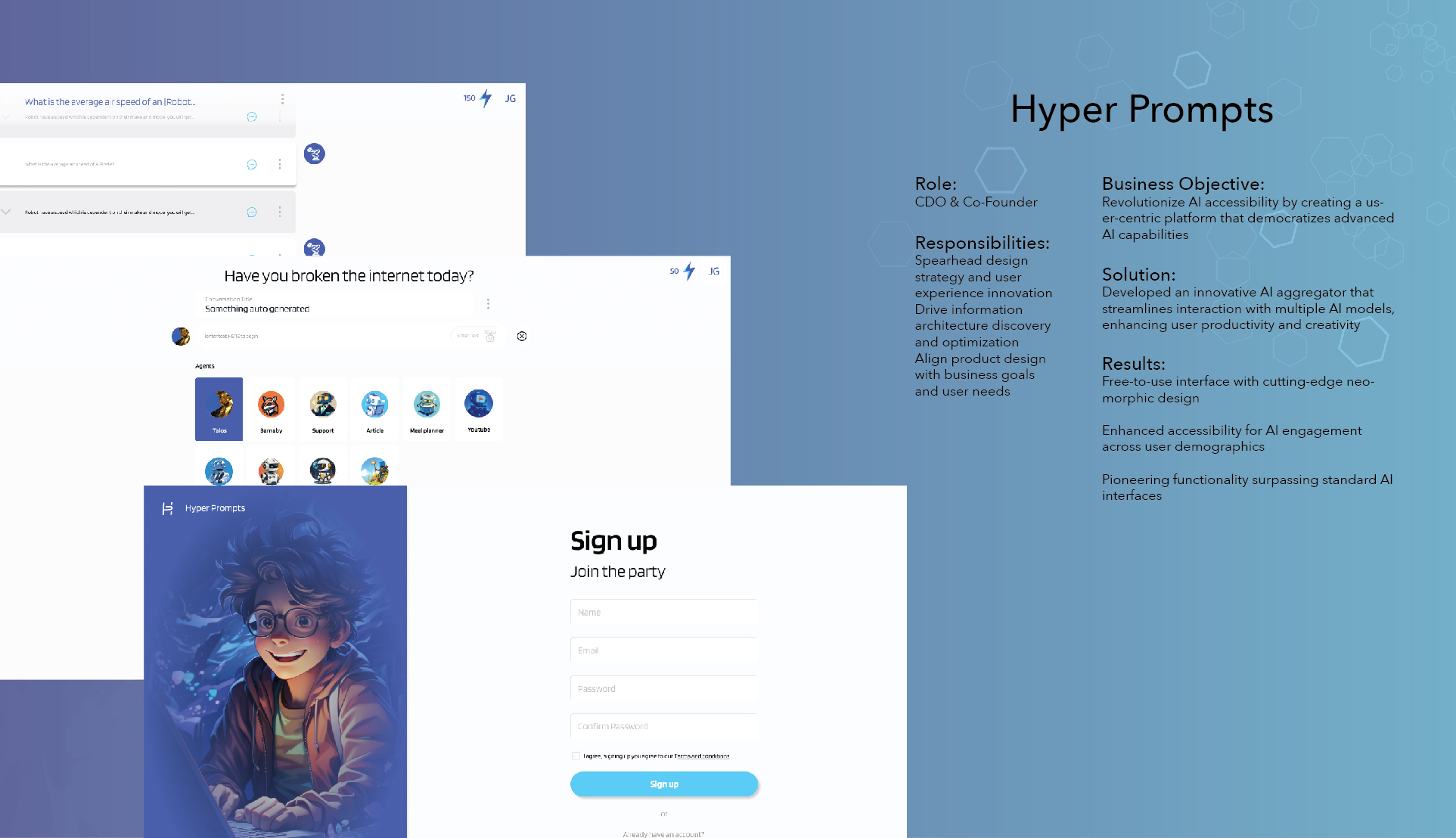
The Solution
A unified platform for AI discovery and use
The MVP launched with 8 integrated AI tools — the architecture was designed to scale to 30+, and the roadmap was a key part of the investor pitch. Users could discover, test, and compare models without managing multiple subscriptions or switching contexts.
Key Features
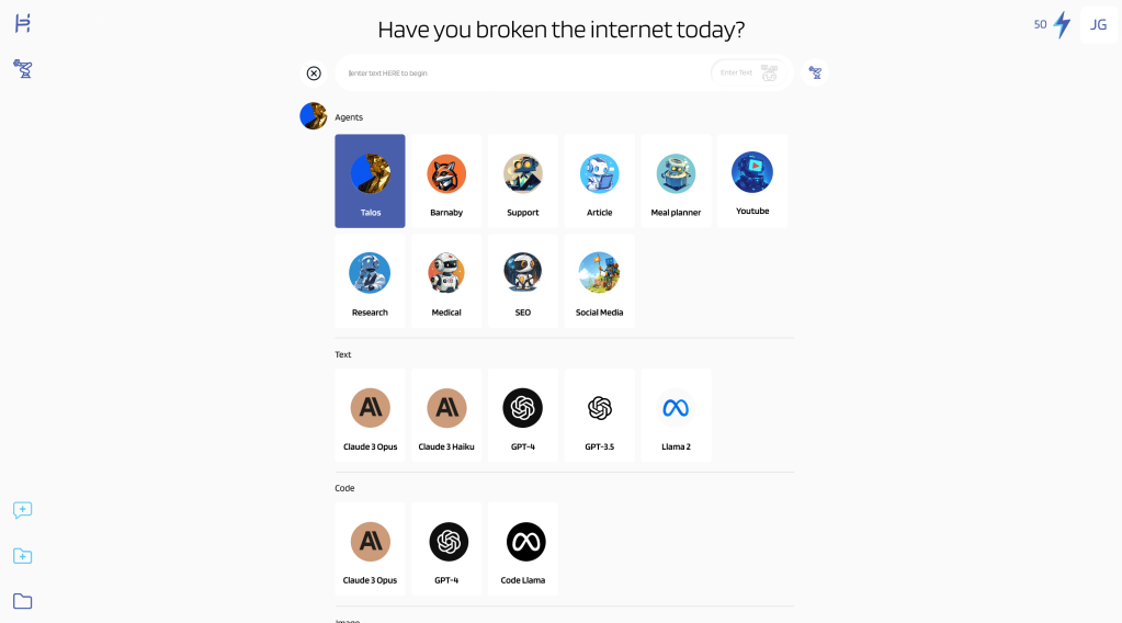
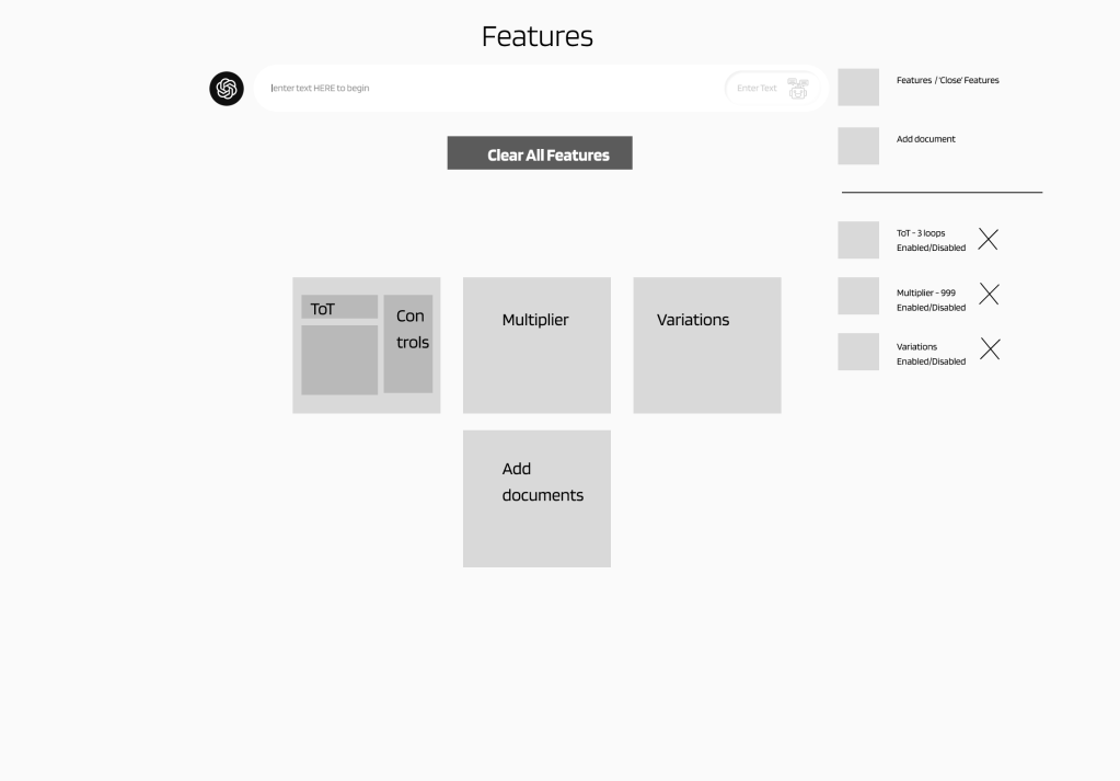
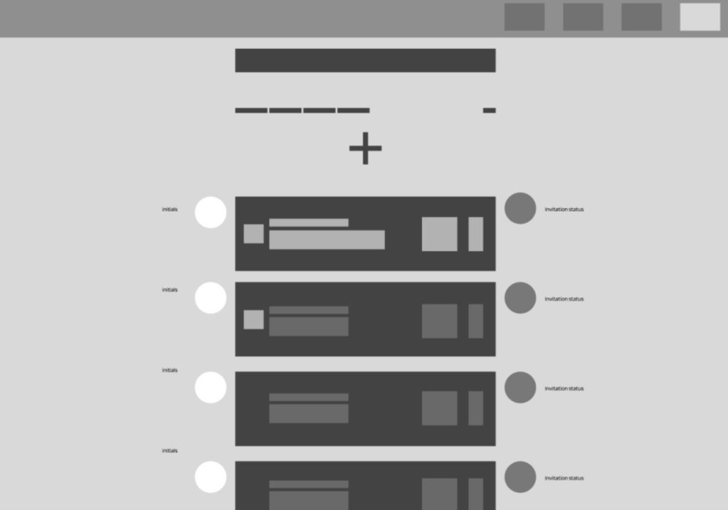
Unified AI Library
Browse and filter AI tools in a single interface. MVP launched with 8 models; the architecture supports 30+ with smart categorization by use case (text, image, code, analysis).
CORE FEATURE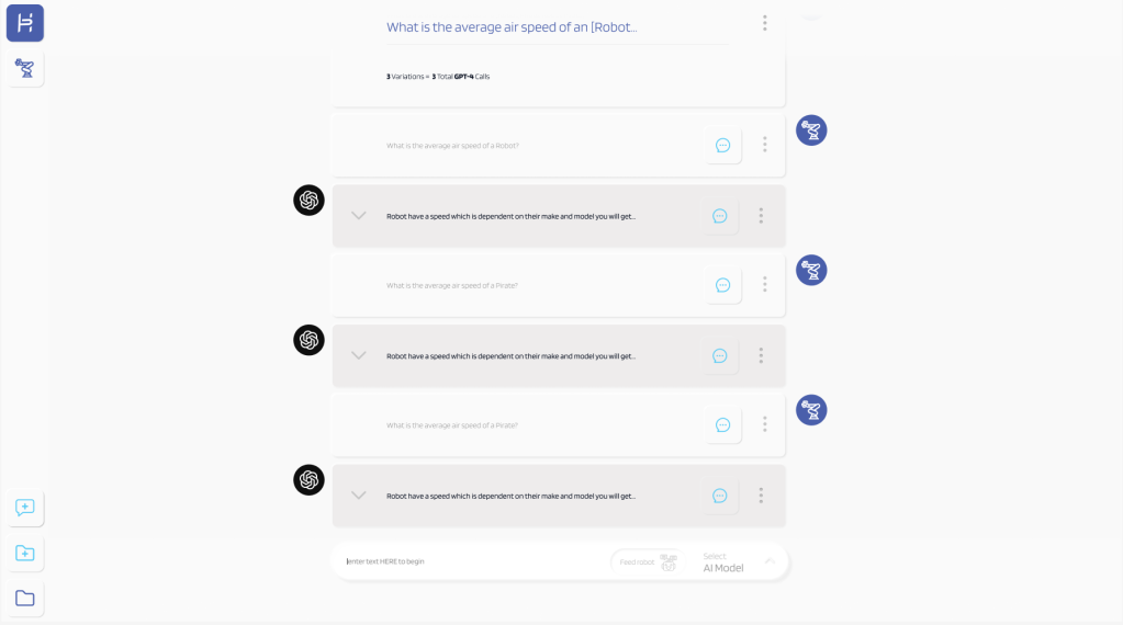
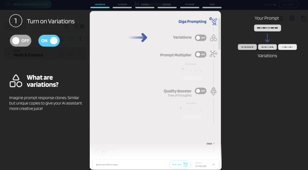
Smart Comparison Tool
Compare outputs from multiple AI models side-by-side with the same prompt. Instantly identify which tool delivers the best results.
USER REQUESTED
Frictionless Onboarding
Get started in under 30 seconds. Email, password, you're in. No credit card required for free tier.
CONVERSION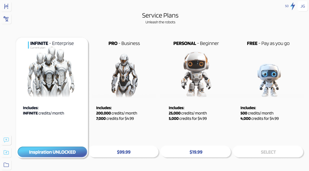
Flexible Pricing
Clear pricing tiers from free to enterprise, with transparent credit systems. Users know exactly what they're paying for.
MONETIZATIONAccessibility Features
-
Keyboard Navigation Full keyboard support for all interactions
-
Screen Reader Optimized Semantic HTML with ARIA labels
-
High Contrast Mode 4.5:1 contrast ratio minimum
-
Responsive Text Scaling Supports up to 200% zoom
Impact & Results
What the work produced
$250K
Seed Funding Secured
Pitch deck and prototypes were central to the raise
$140K
Client Sales Generated
Design system enabled white-label contracts
Before vs. After Launch
| Metric | Before | After | Change |
|---|---|---|---|
| Tool Discoverability | Low | Significantly higher | ~⅓ faster |
| User Satisfaction | ~7/10 | ~9/10 | Clear uplift |
| Product-Market Fit | Unvalidated | Validated |
7
Months to Launch
8
AI Tools at Launch
100%
MVP Delivered
Key Achievements
- Pitch deck and interactive prototypes helped the team secure $250K in seed funding
- White-label design system enabled $140K in early client contracts
- Usability testing validated product-market fit before launch
- Built scalable design system for rapid deployment
- Satisfaction scores rose from ~7 to ~9/10 through iterative testing
- Delivered complete MVP within 7-month timeline
Reflection & Growth
Honest retrospective
Key Learnings
Designing for investors is designing for users
The biggest insight was realizing that investor demos aren't just about aesthetics—they're about proving you understand your users deeply. Every design decision I presented to investors was rooted in research data and user pain points.
A/B testing saves months of debate
Rather than relying on opinions about navigation patterns, we ran A/B tests early. Even with 10 participants, the signal was clear — sidebar outperformed top bar consistently across every metric. Small sample, but unanimous direction.
Design systems aren't overhead—they're accelerators
Building a scalable design system upfront felt like it would slow us down, but it became our competitive advantage. When we landed white-label contracts, we could customize and deploy in days instead of weeks.
User interviews reveal what surveys cannot
The most valuable insights came from watching users struggle with existing AI tools during interviews. They couldn't articulate "I need unified search" in a survey, but watching them copy-paste between tabs made the problem crystal clear.
What I'd Do Differently
Integrate pricing experiments earlier
We waited until iteration 3 to test pricing clarity. Users were confused about tier differences earlier, and we could have validated pricing presentation alongside navigation patterns.
Document decision rationale in real-time
I kept mental notes about why we chose certain directions, but documenting them immediately would have saved time when stakeholders asked "why did we do it this way?" months later.
Involve engineering earlier in design system planning
While the design system was scalable visually, some component decisions created implementation challenges. Having engineering input during the design system phase would have resulted in components that were both beautiful and technically optimal.
Behind the Scenes
"The best design projects are the ones that humble you, challenge your assumptions, and force you to grow. Hyper Prompts did all three."
The Finished Product
A unified AI aggregation platform — from research through investor-ready prototypes