Confusing Navigation
Between media sources
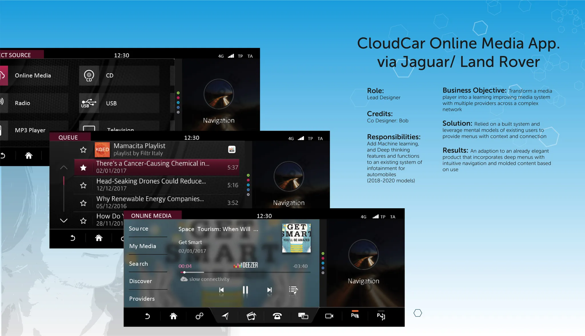
JLR ships millions of vehicles annually. The media app I refined is part of that fleet's standard infotainment stack — meaning the flows I worked on reach a massive installed base.
"How do you refine an almost-finished infotainment system so it's safe, usable, and worthy of a luxury brand?"
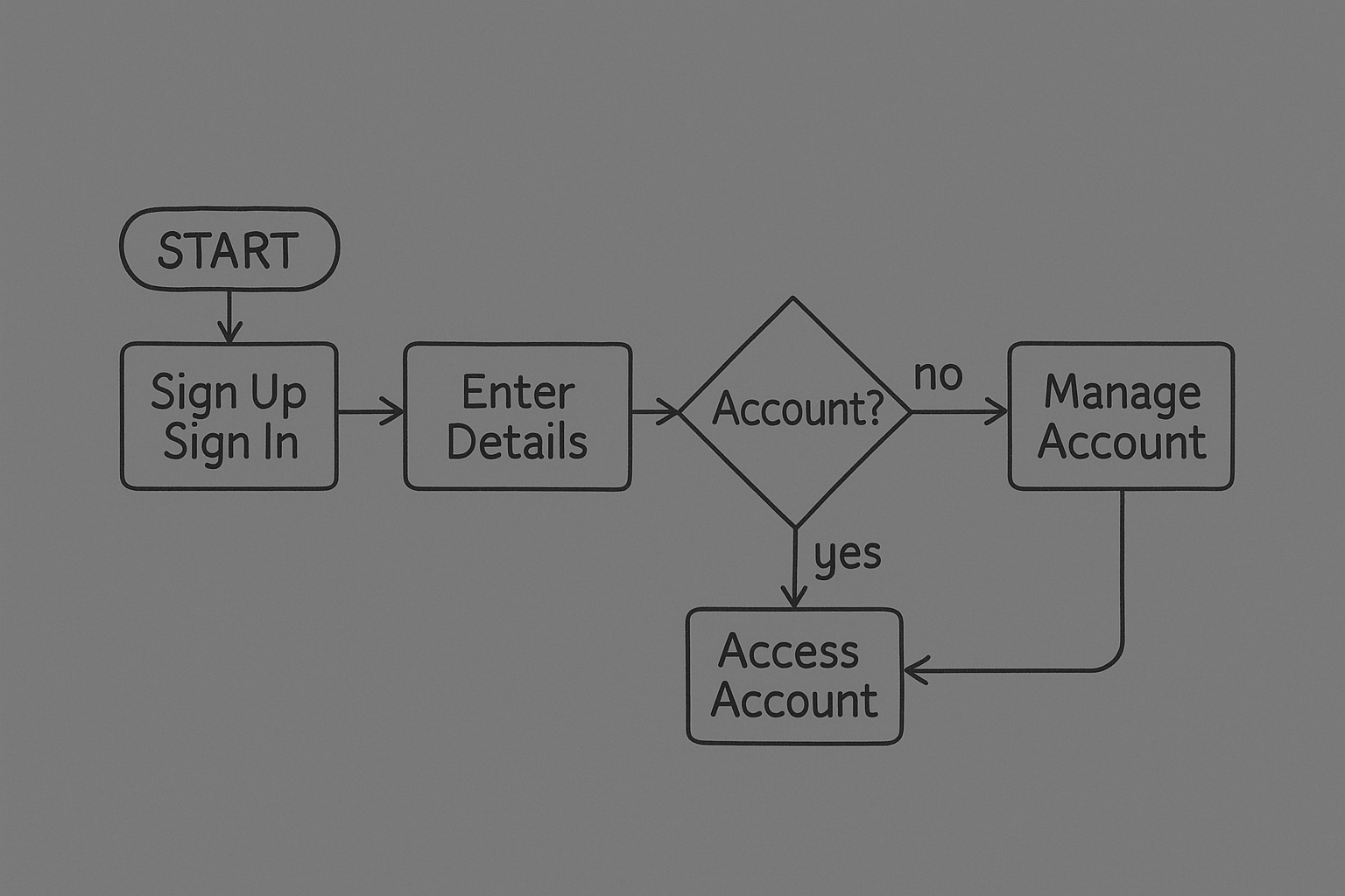
I joined CloudCar mid-development; the core architecture and visual language were already established by a prior team. My job was to improve specific flows — media source switching, account setup, and profile management — without breaking what already worked.
Between media sources
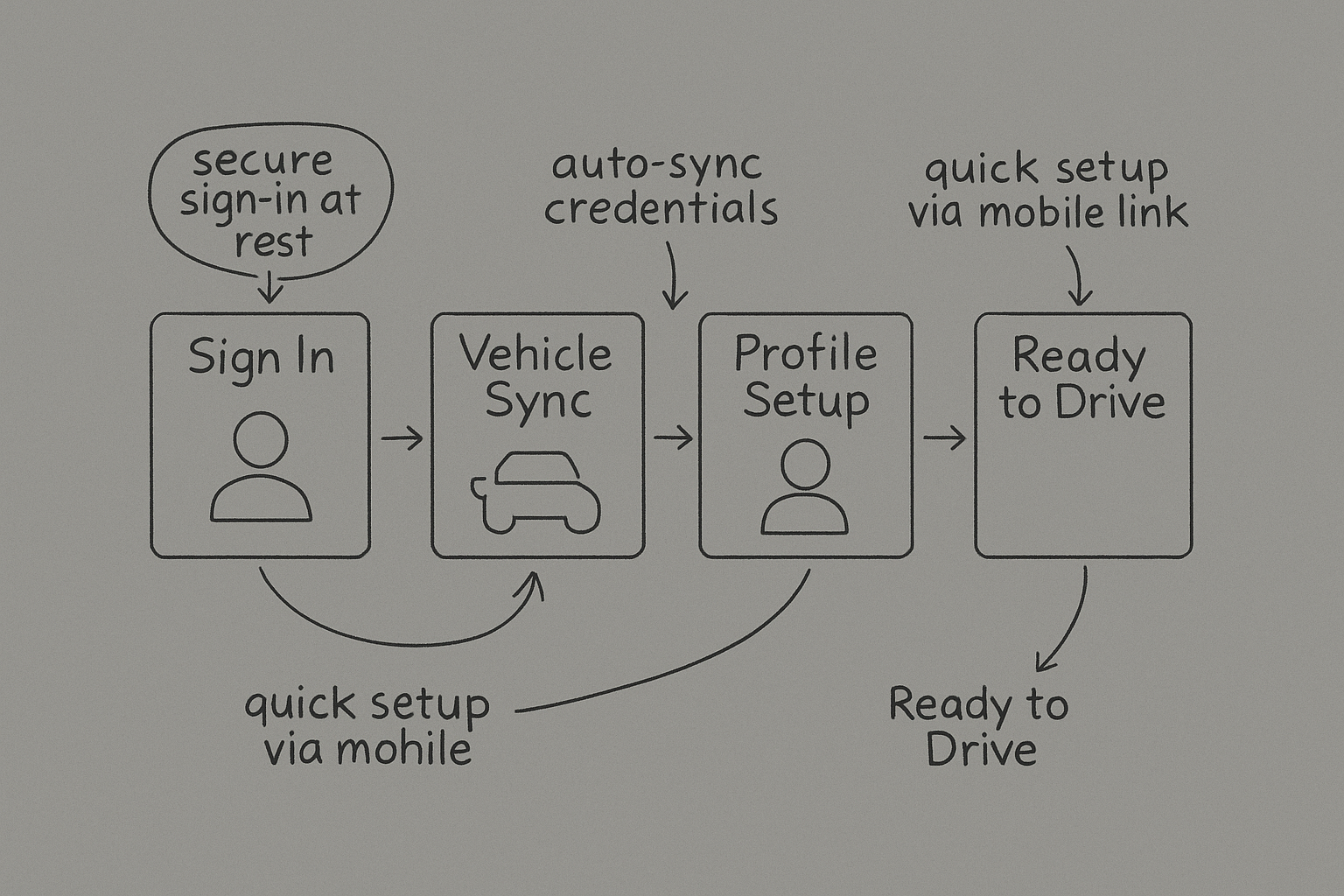
For accounts + profiles
Unsafe in-car use
Reduce driver distraction while browsing media—safety must come first in automotive design
"I just want to play my music without taking my eyes off the road."
— Research Participant, Daily Commuter
What competitors got right, where JLR was falling behind
Benchmarked against BMW iDrive, Audi MMI, Tesla media systems, and other luxury automotive infotainment platforms to identify best practices and opportunities for differentiation.
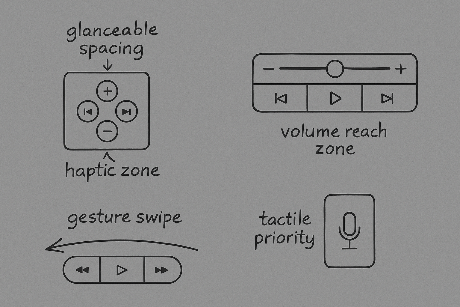
Rotary + touch control
Multi-modal interface
Large touchscreen-first
Error rates benchmarked internally by CloudCar's QA team using identical task sets across competitors
JLR Gen 2 had the highest error rate, requiring significant refinement
"Switching sources takes too many steps."
Daily Commuter, Range Rover Owner
"Profiles should remember preferences."
Fleet Manager, Corporate Accounts
"Clarity is safety."
Product Director, JLR Connected Car
While voice commands reduce distraction, visual interfaces still need to be clear and intuitive for at-a-glance comprehension.
Multiple driver profiles required better organization and faster switching to prevent frustration and setup time.
Luxury users expect consistent continuity between in-vehicle systems and companion mobile apps.
Three driver types, one constraint: eyes on the road
Daily drivers who prioritize efficiency and safety
"Needs fast, safe playback on the go without distraction"
Multiple users sharing the vehicle regularly
"Wants multiple profiles with personalized settings"
High-end customers with premium expectations
"Expects polished, branded experiences worthy of the price"
Refining for Safety & Luxury
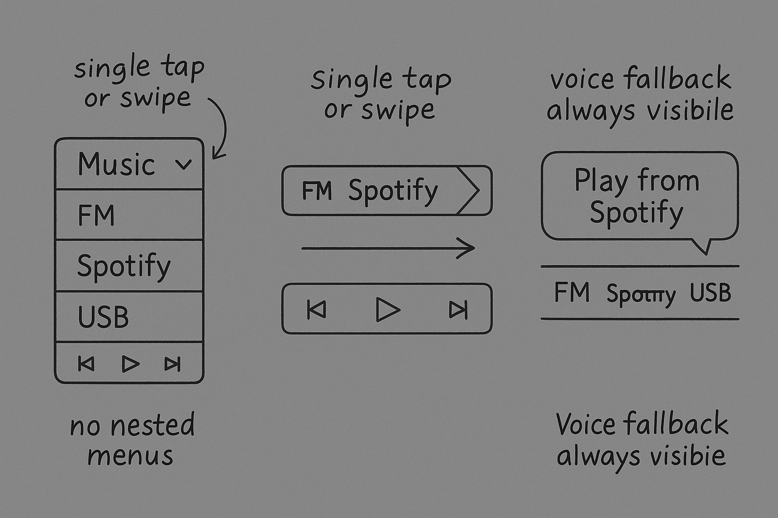
Deep menu structure requiring multiple taps to switch between sources
Why it failed: Too deep for drivers—required eyes off the road too long. Violated core safety principle.
Elaborate transitions and motion effects between screens
Why it failed: Distracting for drivers, slowed perceived performance, and didn't align with luxury brand expectations.
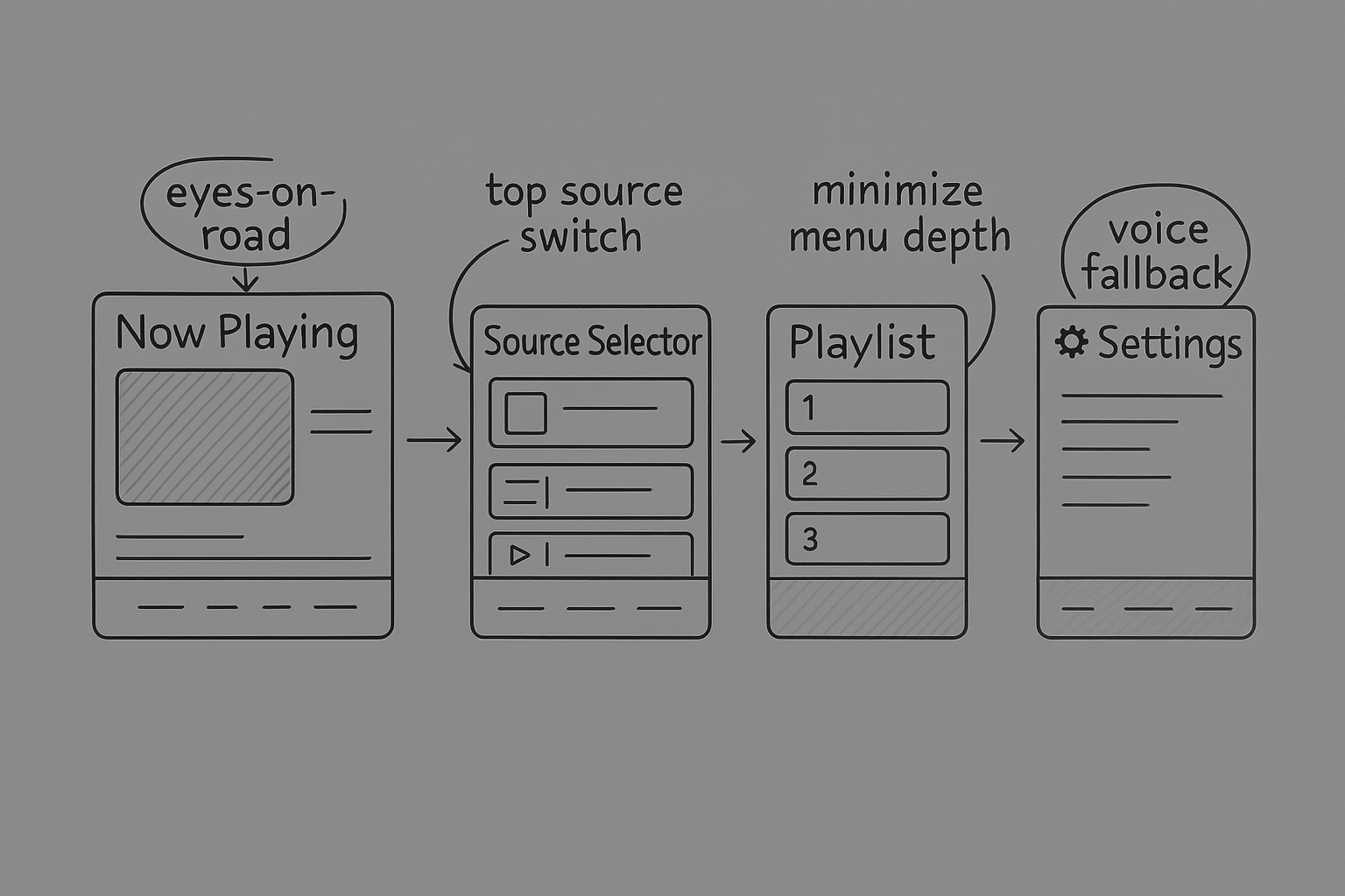
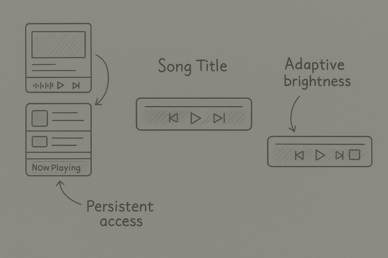
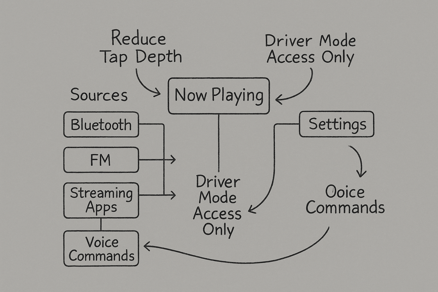
By keeping the currently playing media visible at the bottom of every screen, we eliminated the need for drivers to hunt through menus to see what's playing or make quick adjustments. In testing, this single decision roughly halved the time drivers spent navigating media controls and became the anchor for the entire information architecture. Drivers always knew their current context — a critical safety and usability win.
4 refinement cycles, real vehicles, and a lab-to-production gap
Too detailed, slow recognition
Instant recognition, safer for driving
Note: In-vehicle testing conducted with 12 participants across US and UK markets during refinement cycles.
30 percentage point reduction in usability errors (58% → 28%) from initial testing to final release. The jump from 15% (lab) to 28% (production) reflects real-world conditions — slower hardware, varied screen sizes, and edge-case media sources not in our test matrix.
Validated persistent navigation design decision
Refined for Safety & Luxury
Switch between radio, Bluetooth, streaming apps, and USB with a single tap. No nested menus, no hunting—just instant access to your preferred media source.
Preferences stored per driver—favorites, volume levels, and account settings. The car remembers you and adjusts automatically when you get in.
Voice commands reinforced by simplified UI. Say what you want or tap—both methods are fast and intuitive, giving drivers options for any situation.
Always visible at the bottom of every screen. Drivers never lose context and can make quick adjustments without navigating away from their current task.
One-time login and media continuity across devices. Connect your streaming accounts once and pick up playback across in-vehicle and mobile platforms.
What the refinement produced
"The refinements turned this from 'good enough' to flagship-level design."
— Senior Stakeholder, JLR Connected Car
What I Learned
In automotive design, user experience isn't just about delight — it's about keeping people alive. Every interaction was evaluated against NHTSA visual-manual guidelines: no task should require more than 2 seconds of eyes-off-road or 12 seconds total glance time. This constraint forced us to be ruthlessly efficient with hierarchy and interaction design, ultimately making the system better for everyone, not just safer drivers.
Testing in actual Jaguar Land Rover vehicles revealed issues no prototype could: glare on screens at specific times of day, button sizes that felt right on a tablet but wrong in a moving car, flows that seemed logical in a lab but confusing on the road. Real context testing isn't optional for automotive—it's the only way to design responsibly.
Working with development teams across the US and UK taught me that clear documentation isn't bureaucracy — it's respect. Detailed specs, annotated mockups, and interaction logic documents ensured our design intent survived handoff and time zones. When a developer in the UK could implement a flow at 3am my time using only the spec, that was the system working.
Looking back, I would have introduced real driver shadowing earlier in the refinement process. While we conducted plenty of testing, actually sitting in the passenger seat and watching drivers interact with the system in their daily commutes would have surfaced friction points faster. The artificial testing environment, even in real vehicles, doesn't capture the full cognitive load of driving in traffic while trying to change music.
I'd also push for more aggressive simplification in the first refinement cycle. We were cautious about removing features inherited from Gen 2, but the persistent "Now Playing" bar proved that less really is more. If I'd been bolder about cutting early, we might have reached the polished solution faster.
"Luxury design isn't about flash—it's about clarity, trust, and consistency."
A refined infotainment experience deployed across the Jaguar Land Rover fleet
I'm always open to discussing new projects, creative ideas, or opportunities to be part of your vision.
jgruver@gmail.com